BetterCloud: Atmosphere Design System
The problem
The BetterCloud interface was created on the foundations of both Angular and React (yikes!), with a beta version of Material UI being used as the primary component library. This greatly impacted our ability to delivery a consistent, scalable UI framework.
What is a design system?
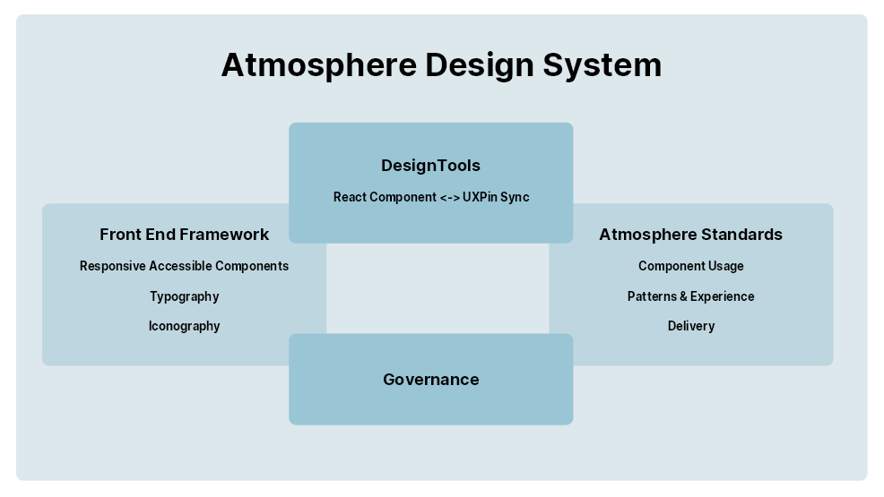
Over the past 10 years, the design system has evolved from simple styles sheets to fully fledged products unto themselves, encompasing styles, tone and voice, patterns, guidance, and governance procedures. Design System help to define the interaction between a product and it's users, user being both the intended audience of the product as well as the the crafters of that product. In short, design systems help design and engineering teams build consistent, scalable experiences based on the success of previous designs.

My Role
Having identified and presented to stakeholders the value of a design system, I lead the charge internally to formalize our design components, standards, and delivery guidelines. Initially, I was an army of 1, but quickly grew to a team of 5 front end engineers. I wore a multitude of hats for this effort in order to get it off the ground:
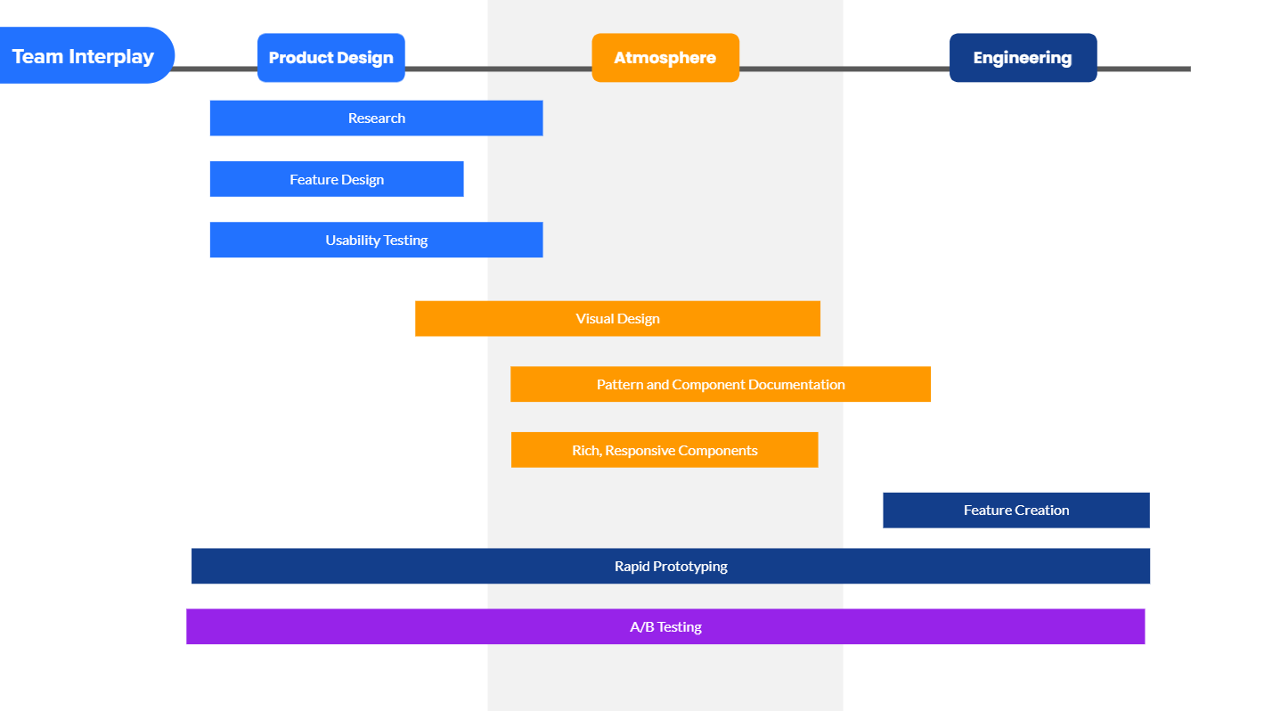
- I acted as Product Manager to help plan our body of work, our roadmap, and how our team interacted with other product teams.
- I was the Primary Visual Designer to help consolidate our visual design language.
- I created an modified existing React Components to help them conform to the new styles, as well as add in additional accessibility features
- Lastly, I created our design system documentation in Storybook to act as our design decision repo.

Challenges of building a design system on top of an existing UI
When I arrived as designer at BetterCloud, we had absolutely no documentation in regards to design patterns, standards, or even a style guide. I was given a few Adobe Illustration files to work from, which were already grossly out of date. This made scaling a design team, or delivering consistent product experiences nearly impossible.
We needed to evolve our design practice, but we could not start from scratch. We had to build a design system on top of our existing way of doing things, which meant documenting components and patterns that may not be ideal for the time being.
- Internal Component & Pattern Audit - We needed to know each component, it's variants, and how it was being used as well as how we strucutred the way users flowed through the application. Our UI was littered with duplicate components, one-offs, and orphaned styles.
- Designer & Engineer Interviews - We needed to understand the pain points that designers and engineers had trying to implement a feature from start to finish.
- Accessbility - Even though our base Material UI components had some out-of-the-box accessibility features, they were very rarely used.
- The Future Product Roadmap - We needed to know not only what the needs of the UI were at our current state of the product, but we needed to know where our Product Team was planning on taking features within the next 6-18 months in order to plan our path.
Designing Version 1
Our goal with Version 1 of the design system was to give the proper foundations to "normalize" our UI by reducing component variations, increase our base accessibility, and remove as much deprecated components & patterns as possible. After 4 months of diligent work, we were able to accomplish:
- 30% reduction in front end UI - We were able to eliminate a large portion of the duplicate components, or components with only minor variations of each other. We eliminated nearly 50% of our typographical styles within the UI, greatly increasing the consistency of our product.
- Addressed multiple color deficiency Accessbility issues - We adjust the contrast ration of 100% of our frequently used components to accomodate our users with non-typical visual accuity.
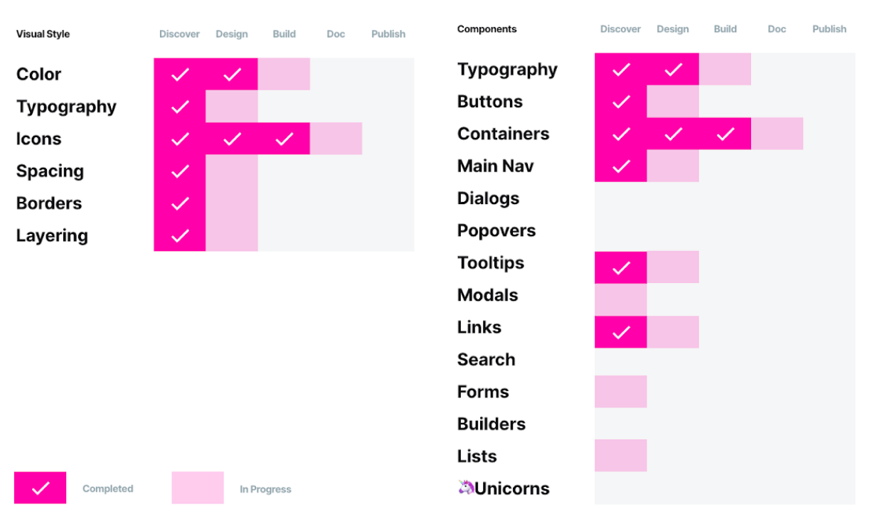
- Documentation - I began documenting the remainin styles, components and patterns into Storybook, along with a changelog of what we have accomplished so far.
Did it work? It absolutely made an impact on the overall look and feel of our product, it's accessibility, as well as gave us a great starting point for future enhancements. We did encounter a number of factors (such as out of date libraries, etc) that ended taking a substantial time to complete, but they were a good investment to make.
Version 2: Code to design tool integration
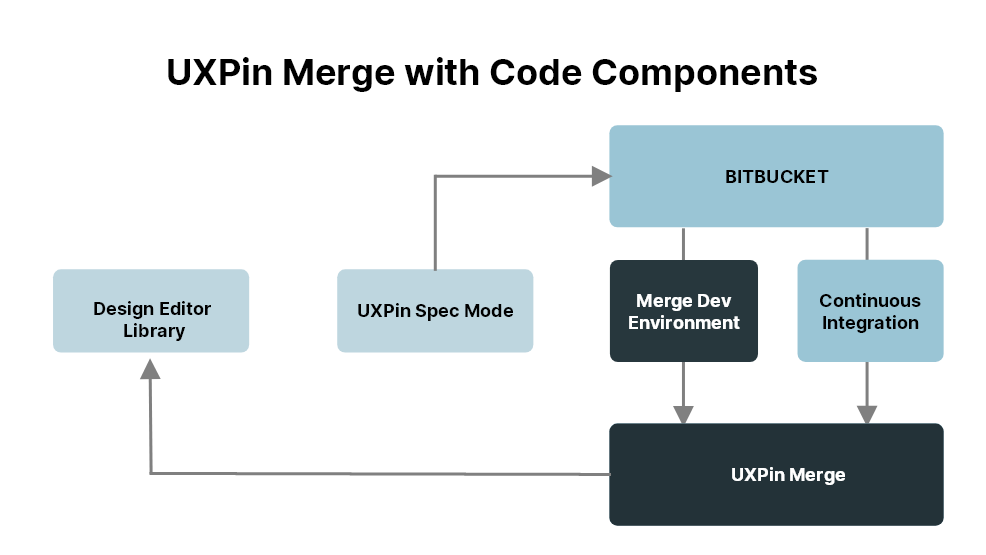
For our next trick, we wanted to speed the process between our design and delivery steps. Our design team uses UXPin, a fantastic browser based design tool that has an key feature that any design systems team should love: being able to import our React components directly into UXPin as real design assets using UXPin Merge. This allowed us to maintain their available props, responsiveness, and rendering as accurately as they would in the app. By setting up a continuous integration process to keep our React components in sync within UXPin, this ensured are designers were building from the same toolbox that our engineers would build form. This increase our consistency from design to development 70%.
Documenting for the Design and Engineering Teams
To make sure our designers and engineers were working from a single source of truth, we implemented Storybook as our documentation tool. Using Storybook with a combination of MDX and my own custom layout components, I was able to help craft a documentation experience that garnered high satisfaction from it's users for completeness and usability.
Where are we today?
We are now finalizing the 3.x version of the design system, also upgrading the backend of our framework into React technology.
What did I learn?
- Collaboration is critical – more eyes on a design, the more it’s presented to varying opinions, wisdom, and analysis — and this can only eventually improve it. Or, at the very least, test it.
- This is a product, not a project - Design systems need to be treated as full products no matter the size, with proper planning, roadmap, and resources. Garner this support early.
- A knowledge repository is a gift for everyone It is crucial to record every aspect of it – this helps team members new and seniors, product managers, near and far in the company can refer to one real source when making decisions.